Having solid, on-brand, and visually striking designs attached to your digital marketing endeavors is vital to your success.
Just think of it like this: Design is at the core of your marketing plan. Your website, social media posts, company videos, and anything else you create all need to have strong, clean, and consistent design — or else they simply just won’t get the attention they deserve.
In fact, 94 percent of first impressions are related to design (Eksposure). Users will even stop interacting with a website if they don’t like how it looks and instead turn to something more visually appealing (QuickSprout).
But when you have clean and consistent designs across all platforms, your revenue and brand recognition will skyrocket (LucidPress).
As a small business owner or graphic design beginner, you don’t want to run the risk of driving away potential customers because of a poorly designed website or social media graphic — but after you read the remainder of this blog, you’ll be well on your way to creating beautiful designs, drawing more engagement to your platforms, and closing sales.
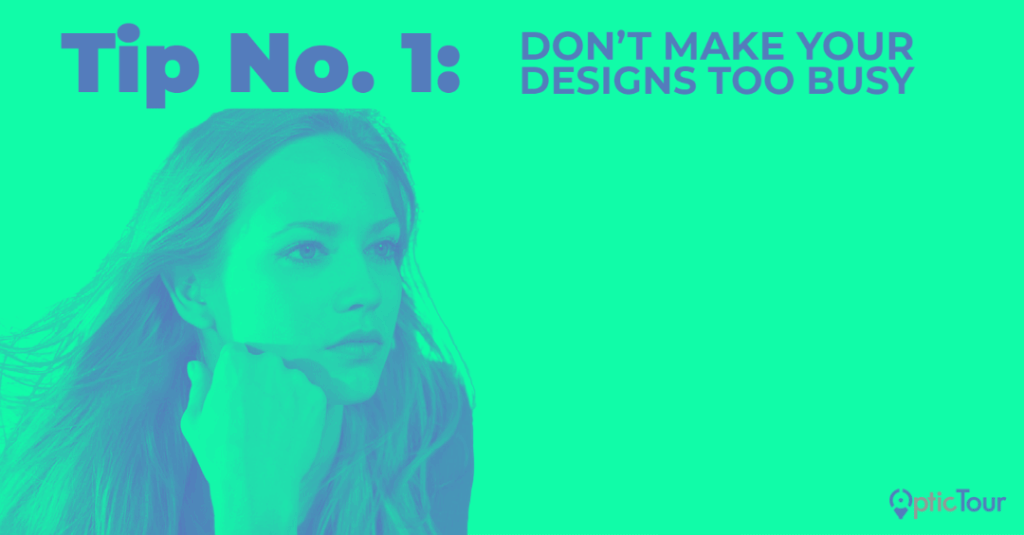
Tip No. 1: Don’t Make Your Designs Too Busy
At the core of your design is the message: the goal you’re trying to achieve. Every design element you employ must solidify your message in some way, shape, or form, or else your goal will become harder and harder to achieve.
You might be thinking it’s best to fill every inch of your design with some sort of text, image, line, shape, etc. — but doing so will only serve to detract from your message and drive people away.
For best results, use section dividers and adequate white space. White space is the area of your design that is left blank, and it basically just gives the more essential elements some room to breathe.
Like this:
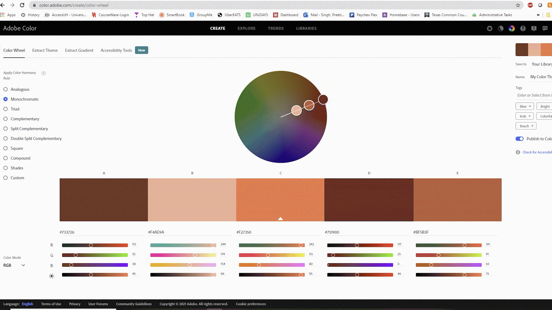
Tip No. 2: Use Cohesive Colors
A color is more than just a color: It’s a feeling, an experience, a vehicle that elicits strong memories. Blue, for example, evokes feelings of trustworthiness, serenity, and responsibility. To learn more about what each color signifies, you can head to this fantastic article from Smashing Magazine.
Whatever colors you choose to relay and solidify your message, it’s vital that they match and speak to one another. Even for professional designers, choosing a set of colors that are perfectly cohesive is a challenging feat — but there are tons of online tools you can use to help you out.
Like Adobe Color Wheel, for example. You can choose from a wide variety of color harmonies, like monochromatic, analogous, and more, and they also have an awesomely handy tool that will auto-select colors that pair well together as you move the wheel around.
Like so:
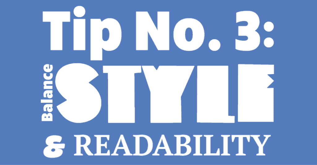
Tip No. 3: Balance Style and Readability
Just like colors, fonts also carry meaning.
Serif fonts convey a sense of tradition and responsibility, and are perfect for instances where you want to appear established and scholarly. Sans serif fonts, on the other hand, are simple, effective, and carry a more casual yet clear tone. You can read more about the six different types of typography and what they signify by heading to this article from Fabrik Brands.
The biggest thing with typography is you want the fonts you choose to contain a solid balance of both style and readability. When getting started, try using stylized fonts for the headers and readable ones to relay important information.
Like this:
If you’re still not sure about which exact fonts you want to choose, you can turn to Adobe Fonts to browse thousands of font types, identify concrete font pairings, and more. For best results, pick a few different pairings out and run a test to see which your audience likes the most.
Even if you think you’ve found the perfect font, if it’s not readable, you don’t want to use it to convey your message. As a rule of thumb, maybe stay away from fonts like Wingdings, but feel free to have a little fun with it, try some things out, and see what kinds of awesome pairings you can create.
Tip No. 4: Pay Close Attention to Spacing
You know a good design when you see one — but did you know there’s a set of rules you can follow that scientifically proves why that design works so well?
That’s right: the rule of thirds!
The rule of thirds is essentially just a guideline that proposes that an image should be divided into nine equal parts by equally spaced horizontal and vertical lines with the focal point of the photo landing on the intersection of said lines.
Confusing? Here’s a picture to help you out:
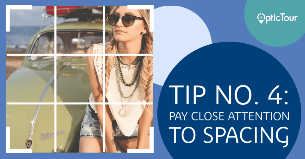
See how the focal point — the girl — lines up nicely with the intersection in the top right-hand corner?
Studies have shown that when viewing images, our eyes naturally fall along these points of intersection — not in the middle like you might expect. By placing your focal points along these intersections, you create balance, flow, and allow your viewer to interact with your design more organically.
For best results, identify the main points you want to include in your design and where you want to place them. Feel free to use a rule-of-thirds template to help you out.
But you know what they say about rules… they’re meant to be broken!
Yes, it’s okay for you to break the rule of thirds. There are tons of striking designs out there that are centered and symmetrical that don’t employ the use of the rule of thirds. However, if you’re looking for a simple and easy way to get started on understanding what goes into a well-balanced design, give the rule of thirds a try.
Tip No. 5: Use Social Media Templates for Inspiration
Still feeling a little unsure about what the best types of designs might look like?
There are thousands upon thousands of pre-made templates you can turn to!
But tread carefully — studies show that original graphics perform the best and drive the most traffic (Venngage). While you should strongly consider making your own designs, there’s no shame in pulling tips and tricks from the professionals.
Here are a few options you can turn to in times of need:
- Creative Market (subscription only)
- Adobe Spark (both paid and free options)
- Canva (both paid and free options)
- Pinterest (free)
Thanks for Reading!
Thanks for reading our blog! We hope it helped you understand the core pieces of what goes into making a great design.
But if you still think you could use a little guidance, our team at OpticTour would love to lend our hands! If you have any questions, you can get in contact with us by heading to this link.
When you turn to OpticTour for guidance on graphic design and branding, your message is sure to be heard across the world. Our design work has played an essential role in guiding marketing campaigns of various types to fruition, and we’d love to do the same for you!
Whether you need assistance with logos, brochures, annual reports, magazine advertisements, website design, infographics, outdoor signage, product packaging, email templates, or something else entirely, our designers will start by learning everything they can about you, your company, and your goals so we can turn it all into a perfect visual representation of your brand.
Our passion for the craft coupled with our desire to teach you how design plays into the wider ecosystem of digital marketing will help bring your company to the next level and keep that growth going for years to come.